 |
| Front Cover |
Foo Fighters - One By One
Throughout the Album, I notice the image of the heart coming up (on the front cover and the inlay), this could be a representation of the album as a whole, considering their use of 'One By One' in dark red text, which often connotes the heart itself. This is a recurring theme throughout the album and adverts for the album (I checked quickly through the use of Google).
 |
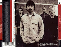
| Back |
Other than black and white, only red is used, both in the text of the album name, parts of the back and for the side of the DigiPak. Red is very emotional and thought of as passionate.
The colour red could be used on this DigiPak for (1):
- Grabbing the attention of the audience
- When attempting not to sink into the background
- Using small doses can work better
There is, of course, the credits on the back, along with the song numbers & names. This is needed, as without it, we could not see the track list, nor would it be easy to recognise this as a CD/DigiPak. There is also the Records Companies & Producers, etc, on the back - Eg. Roswell Records & RCA. This is a standard expectation for a DigiPak or CD design, as is the Barcode.
There isn't much Entropy within this DigiPak, however, it wasn't until more recent years that the obsession with seeming hugely different has seemed to appeared, and as this album is nearly 10 years old, they almost certainly weren't focused on appearing completely different to everyone else available.
I like the use of only a small amount of colour in this DigiPak, and also the way they have taken around 1/4 of the back on the left side to put the credits & track list on, I will attempt to use this in my DigiPak if possible.
No comments:
Post a Comment