Friday, 9 March 2012

Thursday, 8 March 2012
Monday, 5 March 2012
Friday, 2 March 2012
Question 1 - In what ways does your media product use, develop or challenge forms and conventions of real media products?

 The inspiration for my video came from several different other media texts/creations I had viewed and researched into. For example, I used a piece from a different genre of mine as I saw an idea I felt I could use. In the "Eminem - Space Bound" video, I noticed there was a shot where the protagonist (Eminem) would literately split into two on a dual screen, revealing two scenarios, I attempted to create that (however, due to my lack of technical knowledge, I feel it didn't come out nearly as well as I hoped). I also used ideas from "Red Jumpsuit Apparatus - Face Down" & "Linkin Park - Numb" to separate the Band from the Protagonist of the video (Which Eminem's Space Bound Video didn't do). However, instead of completely following the convention (which I found through many rock/indie videos) that the protagonist was a female, I decided to choose a male, and to challenge the ideology that women should be the ones that seem weak in society. The idea that Men could also be considered emotionally 'weak' is an ever emerging ideology, and one that I liked to further. During my audience feedback, nobody commented once on the choice of gender, so either nobody picked up on the idea that it may have been different having a woman playing this, or they felt it was a decent choice. During a group meeting with my focus group, I asked what people felt about the actor, a particular comment was "he fitted the role perfectly".
When creating my video, I didn't want to focus too much on the genre. Walter Jon Williams states that genre labels are only useful as to actually find the audience. Once I had a general idea if I focused too much on making it fit completely to that genre, it could become too redundant to old ideas, etc, and become boring for the audience I was catering to.
I got the idea of having the protagonist alone in the first few shots with a dark background from my own print work earlier in the year, I had several shots with the same actor in a white background, but I felt a black background might be able to add a loneliness to the scene.
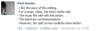 I feel that my media piece did look, to some extent like a real indie video however, on reflection there are some small parts which I'd change. I re-evaluated my research (especially on the 'Face Down' video) and I found myself particularly unhappy with the static, still shots of the band, feeling they broke the pace/feel of the video slightly. Also, I feel the dual-shot could have been done better, but that was due to my lack of technical knowledge on how it'd work out, which shows I should have researched it more. I found some people agreed with this view (screenshot to the left). I also felt that the camera quality wasn't high enough for an official music video, but due to obvious budget reasons, I couldn't afford a professional quality camera.
My video used many conventions of the Indie Rock genre and there was nothing huge to break away from the conventions. However, I felt having a slightly darker tone to the end of the video (Whilst open to interpretation, my first thought was to show people that the protagonist did actually die, shown through him fading away in the very last shot to the end). In videos such as 'Face Down' the character walking away from the house in which such bad things happen hints at a happy ending. There was also the point about showing a man to be vulnerable, but I doubt it's exactly shocking to show that any more.
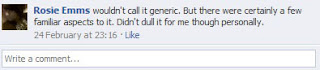
I used a mix of entropic (the split-personality) and redundant (obvious, general band shots) ideas to keep my video a little more exciting for the viewer, but not so strange and crazy that it confused the audience. Steve Neale stated that the audience takes pleasure from genre with uses of 'instances of repetition and difference', therefore too much different or too much repetition would have a bad effect on my text, which is what I wanted to avoid. I asked my audience how they felt about it, and the comment that struck me the most was when somebody identified that there was 'familiar aspects' but it didn't dull it for them. I felt using the split screen and the same person twice in a single shot helped to keep the audience on their toes and make them curious as to what would happen. Nobody seemed to think my text became too similar to other texts.
I got the idea of having the protagonist alone in the first few shots with a dark background from my own print work earlier in the year, I had several shots with the same actor in a white background, but I felt a black background might be able to add a loneliness to the scene.
 I feel that my media piece did look, to some extent like a real indie video however, on reflection there are some small parts which I'd change. I re-evaluated my research (especially on the 'Face Down' video) and I found myself particularly unhappy with the static, still shots of the band, feeling they broke the pace/feel of the video slightly. Also, I feel the dual-shot could have been done better, but that was due to my lack of technical knowledge on how it'd work out, which shows I should have researched it more. I found some people agreed with this view (screenshot to the left). I also felt that the camera quality wasn't high enough for an official music video, but due to obvious budget reasons, I couldn't afford a professional quality camera.
My video used many conventions of the Indie Rock genre and there was nothing huge to break away from the conventions. However, I felt having a slightly darker tone to the end of the video (Whilst open to interpretation, my first thought was to show people that the protagonist did actually die, shown through him fading away in the very last shot to the end). In videos such as 'Face Down' the character walking away from the house in which such bad things happen hints at a happy ending. There was also the point about showing a man to be vulnerable, but I doubt it's exactly shocking to show that any more.

I used a mix of entropic (the split-personality) and redundant (obvious, general band shots) ideas to keep my video a little more exciting for the viewer, but not so strange and crazy that it confused the audience. Steve Neale stated that the audience takes pleasure from genre with uses of 'instances of repetition and difference', therefore too much different or too much repetition would have a bad effect on my text, which is what I wanted to avoid. I asked my audience how they felt about it, and the comment that struck me the most was when somebody identified that there was 'familiar aspects' but it didn't dull it for them. I felt using the split screen and the same person twice in a single shot helped to keep the audience on their toes and make them curious as to what would happen. Nobody seemed to think my text became too similar to other texts.
Friday, 10 February 2012
Sunday, 18 December 2011
Shot List
| Song Part | Shot | Shot Type | What happens in the shot? |
| Intro : First 15 seconds | One - Seven | Close-up | Close up & Extreme close ups of face, fade out between |
| Verse 1 | Eight, nine, ten | Close up, Match-On-Action | Shots of band. Eight = Lead Singer. Nine = Close up of Guitar Ten = Drums |
| | Eleven | Mid-Shot | Paul pacing bedroom |
| | Twelve | Close-up | Bully face, black background |
| | Thirteen, Fourteen, Fifteen, Sixteen, Seventeen, Eighteen | Close-up, Mid-shot to Close-up | Shots between angry/laughing bullies & increasingly close shots of Paul, closing up to his face |
| Music louder, closer to chorus | Nineteen | Mid-shot | Paul throws items off of desk in fit of fury |
| | Twenty, twenty one, twenty two | Close-up & Extreme Close-Up | All three in quick succession, close to Paul's face, showing fury as he does this. |
| | Twenty three | Mid Close-up | All of the bullies laughing sinisterly into camera lense |
| Chorus | Twenty four, Twenty Five | Match-On-Action, Close up | 24 – match on action closeup of guitar, close-up lead singer |
| | Twenty Six | Mid-Shot | Paul runs from room, towards stairs, camera is behind him |
| | Twenty Seven, Twenty Eight | Match-On-Action, Close-up | Drummer playing drums, close up from behind |
| | Twenty nine, Thirty, Thirty One | Jump-Cuts, Wideshot | Paul running down stairs, three jump cuts |
| | Thirty two, thirty three, thirty four | Mid-shot, match-on-action, continuity | Paul gets down stairs, opens the door, runs out |
| | Thirty five - Fourty Two | Long Shot | Paul runs from house, extremly quick editing to Paul running through streets, etc |
| Chorus ends, Verse 2 begins | Fourty Three | Long Shot | Paul stops, hands against walls, catches breath |
| | Fourty Four | Close-up, focus change | Paul out of breath, see a group of laughing youths |
| | Fourty Five, Fourty Six, Fourty Seven, Fourty Eight | Shot-Reverse-Shot, Long-shot | They laugh at him, then leave |
| | Fourty Nine | Mid-shot | Shot from side of paul, he leaves |
| | Fifty | Establishing shot | Shot of woods |
| | Fifty One, Fifty Two, Fifty Three, Fifty Four | Point of view, crabbing shots | Goes between point of view & crabbing shots of Paul walking through woods |
| | Fifty five | Cutaway | Wide-shot of band |
| | Fifty Six, Fifty Seven, Fifty Eight | Over-the shoulder & Close-up | Paul looks both ways in woods, one is light, one is dark |
| | Fifty Nine | 'Split-shot' | Camera goes behind, he 'splits' off into both direction. One half goes on way, one goes the other. |
| | Sixty | 'Continued Split-shot' long shot | Camera watches him walk away either way. |
| | Sixty One | Long-shot | Paul walking from woods, considerably more contrast/darkness in shot. |
| | Sixty Two – Sixty Five | Mid-Shot, Mid-Close up, Close up, Extreme close up | Jump Cuts closer to Paul, still dark |
| | Sixty Six | Cut to mid-shot | Paul, normal light |
| | Sixty Seven-Seventy Five | Mix of shots | Mix of dark/light Paul travelling towards the same cathedral & band shots |
| Chorus Begins | Seventy Five – One hundred | Mix | Band playing & both Paul's looking at graveyard & church |
| Chorus Ends, Guitar Solo | Hundred and one | Close-ups | Guitar/Guitar player |
| Interlude of Song | | Close-ups, mid shots, | Pauls looking at gravestones |
| Ending Chorus Repeats | | Close-ups, mid shots, wide shots, long shots | Lots of band shots, both Pauls moving to tree. Sit down either side, both back in the same shot, 'Split-shot' again. |
| Outro | | Close up | Hand falling down, dropping pill bottle,another hand reaching out to grip it. |
Saturday, 17 December 2011
Exposing only one colour in Video
As with my Digipak, I'd like to use this effect in my video, when using clips of the band, so whilst this quide is for the wrong software, I'm pretty sure it's the same general idea for Adobe Premiere. I will test this at a later date.
http://www.wonderhowto.com/how-to-expose-only-one-color-film-footage-final-cut-pro-362313/
Friday, 16 December 2011
Tuesday, 13 December 2011
Location & Permission
My House
There is no permission needed here, it's all sorted, Paul will come to my house on a monday when my parents are at work, so I need not worry about them being in the way, etc.
SJS Band Member House
That is all sorted with the manager, we can use their house.
Pershore Abbey
I got into contact with the Pershore Abbey Minister via e-mail, and he wanted me to ring him so we could arrange a date to meet face to face. After several attempts ringing him in the allotted hours he suggested in the e-mail, with no reply, I realised he was probably extremely busy with Christmas coming up. So I decided, a little after Christmas day, I will ring him again, to try and get a date sorted to meet him. Below is the e-mail reply he sent. I will keep this posted & updated.

There is no permission needed here, it's all sorted, Paul will come to my house on a monday when my parents are at work, so I need not worry about them being in the way, etc.
SJS Band Member House
That is all sorted with the manager, we can use their house.
Pershore Abbey
I got into contact with the Pershore Abbey Minister via e-mail, and he wanted me to ring him so we could arrange a date to meet face to face. After several attempts ringing him in the allotted hours he suggested in the e-mail, with no reply, I realised he was probably extremely busy with Christmas coming up. So I decided, a little after Christmas day, I will ring him again, to try and get a date sorted to meet him. Below is the e-mail reply he sent. I will keep this posted & updated.

Monday, 12 December 2011


Friday, 9 December 2011
Choreography/Movements and Blocking
Camera Positions & Movement
The camera positions and movements whilst viewing the band will follow them almost completely, including close ups of the use of the instruments & singing.
The camera will also, at times, follow the main 'character' in this video in several ways. Sometimes it will follow behind him in his exact footsteps, sometimes it will watch him as he does something or is involved in something.
The performer positions and movementsThe bands positions will generally include playing instruments & singing, there won't be any fixed choreography in time with the music other than singing & playing the instruments. There will be no fixed choreography in the way of dance, etc. Again, with the 'main character' there won't be any fixed choreography, there will be close up, emotional moments, etc, but no actual dance, etc.
The location of other important features of the mise en sceneWhilst in the bands house, there will of course be an amp, etc, to make the band playing look realistic, and whilst in front of the cathedral, they will need to be placed decently in front of the church.With my 'main character' who ends up spiralling into death in one 'storyline' I will need things such as the pills I will show to suggest his death. There will also be a scene where he walks through a graveyard, the gravestones will be key in this scene.
Camera Movement & Blur TestI used a camera to film my media teacher to see at what speed would the camera begin to blur and how quickly it would focus, etc. Below is the result.I found that I had little problem with camera blurring under fast movement, however, when I was moving the camera fast, as I most likely would in the music video filming, I often lost sight of my target, I will need to be more careful when actually filming and keep a close eye on what the camera can see.

Wednesday, 7 December 2011
Performers - Casting

Lead Singer & Guitarist: James Mattey
Drumer: Seb Fell
Bass Guitarist: Sarah Walker
Depressed Teenager: Paul Austin
Possible Extras: Sarah Tyrer, Cameron Fairburn, Sam Jeffrey, Rosie Emms and maybe others.
For my casting, I have already decided the four main people ion the music video. This will include the actual band, as shown to the left, who will mainly be in the chorus playing the instruments. The 'main character' of the Video, and album in general, will be played by a friend of mine named Paul Austin. He does Drama at A Level, and did so at GCSE also.
He is the main face of the Digipak, due to the ide aof the 'album' to be following the story of this teenager (Who will be played by Paul).
 He is reliable, as shown by him showing up on perfect time for the photoshoot, and he fits the part for a rock music video well, as he has longer hair, which fits a slightly stereotypical view of rock listeners. Due to his acting ability and comfort infront of a character, he will be able to play a troubled/depressed teenager well.
The band will also be reliable as they are receiving a music video from his, therefore they are just as hopeful as me for this to go well.
There will also be arguing parents of the main character within the video, these will be played by my parents.
The people I have picked out to be Extras are all fairly close friends and over half of them also do drama at A level, so they will be fine in front of a camera.
Time Management - Research & Planning
What I plan to do & When:
Lessons:
07/12/11 - Performers & Casting, Time Management sheet
09/12/11 - Choereography/moments & blocking, Costumes & Props
12/12/11 - Continued Research into target audience, Storyboarding
14/12/11 - Storyboarding
15/12/11 - Storyboarding
16/12/11 - Shotlist
Out of Lessons:
10-11/12/11 - Organisation of locations/permission & Research into target audience
17-18/12/11 - Finish off anything unfinished.
Lessons:
07/12/11 - Performers & Casting, Time Management sheet
09/12/11 - Choereography/moments & blocking, Costumes & Props
12/12/11 - Continued Research into target audience, Storyboarding
14/12/11 - Storyboarding
15/12/11 - Storyboarding
16/12/11 - Shotlist
Out of Lessons:
10-11/12/11 - Organisation of locations/permission & Research into target audience
17-18/12/11 - Finish off anything unfinished.
Monday, 5 December 2011
Additional 'Research' which inspired me for this video
As mentioned earlier in my blog, several music videos inspired me when creating this video.
Including Linkin Park - Numb, Red Jumpsuit Apparatus - Face Down and Eminem - Space Bound.
These have all inspired me in several ways, as I felt it included as research, I felt I would explain why.
First, the Space Bound video by Eminem. This video is nothing to do with the genre I wanted to do, other than a few guitar rifts. However, if you watch the video, at exactly 1:20, Eminem 'splits' into two, using the same camera trick I want to do. This video inspired me to do this, as I thought it was a really good concept, yet I felt it wasn't played upon enough, in this video, one side got angry, etc, and the other side just sat down and rapped.
Second, Linkin Park - Numb, this video inspired me in two ways. First, the very basis of my music video, having the band and the 'story' of the video completely separate. In this video it follows a girl who is too going through some depression and it feelings rather abandoned and alone. I felt it worked extremely well, as it is one of Linkin Parks' biggest Music Videos.
Finally, with Red Jumpsuit Apparatus, they too used the 'separate' feel from the band and the main character, however, they had a slightly more 'indie' feel which I felt would work for my band, in the way that they were playing in a simple house, nowhere special, whilst Linkin Park was playing in a church.
These three videos inspired me greatly during the research & planning phase of the video.
Including Linkin Park - Numb, Red Jumpsuit Apparatus - Face Down and Eminem - Space Bound.
These have all inspired me in several ways, as I felt it included as research, I felt I would explain why.
First, the Space Bound video by Eminem. This video is nothing to do with the genre I wanted to do, other than a few guitar rifts. However, if you watch the video, at exactly 1:20, Eminem 'splits' into two, using the same camera trick I want to do. This video inspired me to do this, as I thought it was a really good concept, yet I felt it wasn't played upon enough, in this video, one side got angry, etc, and the other side just sat down and rapped.
Second, Linkin Park - Numb, this video inspired me in two ways. First, the very basis of my music video, having the band and the 'story' of the video completely separate. In this video it follows a girl who is too going through some depression and it feelings rather abandoned and alone. I felt it worked extremely well, as it is one of Linkin Parks' biggest Music Videos.
Finally, with Red Jumpsuit Apparatus, they too used the 'separate' feel from the band and the main character, however, they had a slightly more 'indie' feel which I felt would work for my band, in the way that they were playing in a simple house, nowhere special, whilst Linkin Park was playing in a church.
These three videos inspired me greatly during the research & planning phase of the video.
Post-Digipak Audience Feedback


After finishing the Digipak, I went back to some people who I knew were rock fans, and asked them a few questions, to the left is one of the responses. There were only two things I heard complains about - first, that the stars ratings should have been in white, instead of black.
Second, from only one person, (whilst talking in person, which I didn't film) that they didn't understand why the guitar was at the dinner table on the front of the Digipak. However, he only brought that up once I pointed it out, he then afterwards said that he still liked it as it was "A bit weird, which you see a lot on front of albums". So despite the idea of 'humanising' the guitar didn't come across (possibly due to me not doing it strongly enough), it still worked, as it was just generally a more entropic idea, which, looking through Rock albums, is often the case.


Monday, 14 November 2011
Logo Ideas
Just some ideas for the Digipak logo/how I would have the name. I circled what I liked in the end, hopefully it will turn out well in the finished product.


Friday, 11 November 2011
Advert Research : Duff McKagan's Loaded - The Taking

The first thing I noticed about this advert design is theme of grey colouring. I only notice two colours other than black, white and grey. There is a tiny purple line around the CD design to the bottom right and the red star in the band's name, this, however, upon checking up on the band, is often there in the name, so I know to ignore this for the particular advert. There are also colours in the icons at the bottom (such as the facebook and twitter icons).
I notice that the album name "The Taking" is written in black marker pen over a line of duct tape. This, along with the hands tied with rope, connotes a feeling of being imprisoned or kidnapped. I assume that this is a feeling that will resonate across the album, being trapped. I notice that the skin is also very pale and the image of the band is also kept in the black and white effect.
The Colour grey is a very neutral colour, and is quite a conservative colour. There are many things it can be used for, some are relevant to this picture, some aren't. Here are a few that are:
- Cold
- Gloom
- Horror Elements
The white lettering over black/dark grey colouring makes it stand out, so you can see it better. If they'd use simple black lettering, it would be near impossible to read with the background. There is no single theme on the lettering of the advert, the name of the album, the name of the band and the information about songs to the right is all used in different fonts.
The use of the hands being tied on front of an advert is quite an entropic look. However, due to the magazine I pulled this from being a Heavy Metal/Rock magazine, it's not nearly as entropic as it usually would be. It's not quite redundant, still odd but it fits in more. However, if a pop musician did this, then it would be very rare and entropic.
There are, as always, the redundant images of the bands record company "Armoury" for this band. And the facebook, twitter and youtube images at the bottom are also redundant. They have only been implemented on adverts, etc, recently, but the 'craze' quickly caught on, and it is no an everyday thing to see.
I like the use of the hands being tied up, and that is an actual photographic image, not something an artist created. I don't have the funds to pay an artist to create/draw band images, so it would be a lot easier if I used a photographic image like this. I also like the image of being tied up on this. I might use this idea, but make it my own, it would have to be different.
Subscribe to:
Posts (Atom)